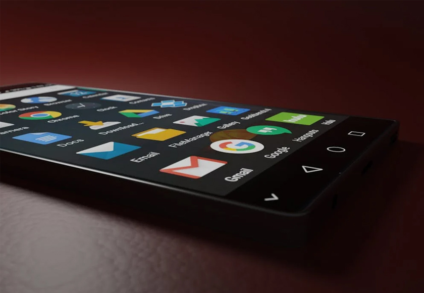
Mobile devices dominate internet usage globally. Designing with a mobile-first mindset ensures that users enjoy fast, intuitive experiences regardless of screen size. It’s about simplifying layouts, speeding up loading times, and optimizing navigation.
“Mobile-first design ensures your website performs beautifully on the devices your customers use most.”
Lila Kim, UX Designer
Designers must prioritize responsive design, adaptive layouts, and mobile-friendly features to meet users’ expectations and behaviors. Performance, clarity, and minimalism are key.


Businesses that prioritize mobile usability increase user satisfaction, reduce bounce rates, and drive more conversions from mobile traffic.
3 Comments
This is exactly what i was looking for, thank you so much for these tutorials
It would be great to try this theme for my businesses
What a nice article. It keeps me reading more and more!